Sometimes the brief starts with a simple rule.
“Don’t show our UI.”
That was the challenge behind a recent SaaS launch video we worked on.
Farsight was establishing itself in a competitive space, and the goal wasn’t to walk viewers through screens or features.
The goal was to signal something bigger.
They wanted a hype piece. Something that positioned them as a serious contender from day one.
There was one catch…
Farsight didn’t want to show off their current UI.
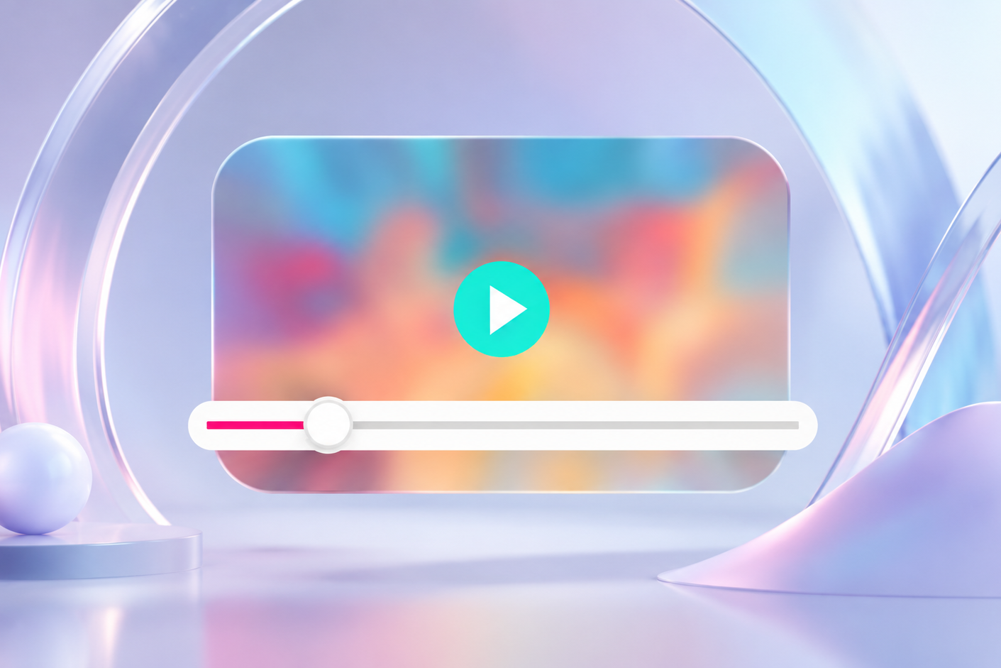
No screens to capture. No demos to record. No workflows we could open and explore. All we had to start with was the brand foundation: a logo, a font, and a color palette.
So instead of showing the software, we focused on visualizing the idea behind it.
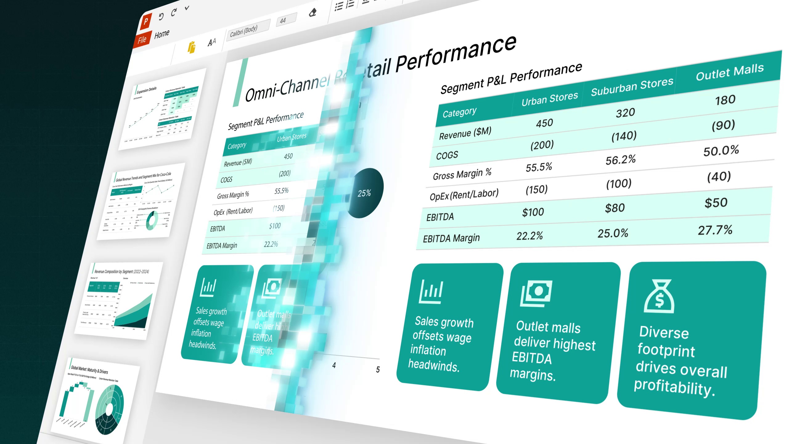
In this case, the core concept was workflow-first, not showcasing features. To make that clear, we designed the product experience ourselves.
Every interface moment, every click, every screen transition had to feel believable, even though we created the UI just for the video.
That meant designing UI from scratch that bankers would recognize as real while still keeping the visuals abstract enough to feel cinematic.
It’s a different kind of challenge than a traditional explainer.
You’re not documenting a product.
You’re helping define how the product should feel.
When it works, the result isn’t just a video. It becomes an early expression of the brand itself. The tone, the motion language, and the visual system can carry forward into future content as the product grows.
In many ways, these projects sit somewhere between product design, storytelling, and motion design.
And that’s where some of the most interesting work tends to happen.
Thanks for reading our article!
If you need a video that helps position your brand, sharpen your message, and make your product easier to believe in, let’s talk.